In order to turn your WordPress website a great platform of sharing knowledge, its better be required that you do have a large chunk of visitors with you. And, that only be possible, if you have mobile edition of your website also available along with web edition. Since the way the tech has been changing and mobile – the use of smartphones – made an important place in our lives, people now also likely to search for sites through their mobile phones. In order to reach the mobile audience, a WordPress website can be optimized for mobile devices. We have collected seven – both free and premium plugins – which helps you accomplishing the task.
Free Plugins
Wapple Architect Mobile Plugin for WordPress
The plugin allows you to mobilize your blog in minutes. It tailored whole of your blog and turned into mobile website. Devices are detected by using Wapple’s advanced web services instead of relying on inferior third party tools. Moreover if you view your blog with a brand new, never before seen handset, it still works awesome.

- Dynamic resizing of images
- Retain SEO, preserve your URL structure and promote one single domain
- Mobile Advertising Integration: Admob & Google Adsense
- View stats on Mobile Page Impressions
- Fully compatible with WordPress MU
- Support for multi-lingual characters – even funny characters that make their way onto your blog (from a copy and paste from Word for example) are handled.
- Comment from mobile! Turn on the feature and your visitors can leave comments from their handset.
- Upload mobile specific header/footer images – resized on the fly to fit a visitors handset perfectly
- Place mobile friendly navigation links around your site to help users browse around your blog
- Advanced pagination – split up long posts into manageable chunks that make reading a post on mobile easier
- Any theme that you’ve installed will have its styles carried across to mobile giving you a consistent look and feel for all your visitors.
- Complete freedom over how you want to style your mobile site. We’ve done our best to make the mobile stylesheet as comprehensive as possible but no doubt there will be a few things you want to change – you can by editing a few settings.
- Control over almost every element on your mobile page:- change the size and quality of images on posts and pages, show tags and categories in different sections, you can even change the wording of certain elements on your site
WPtouch
The plugin automatically transforms your WordPress website for mobile devices, complete with ajax loading articles and smooth effects the time when viewed from devices, like iPhone, iPod touch, Android mobile phones, BlackBerry and more. Further, the admin panel lets you customize many aspects of its appearance and delivers a fast, user-friendly and stylish version of your site to touch mobile visitors, without requiring a single bit of code affecting your regular desktop theme.

- Allows you to set up web-apps for iOS devices easily
- Loads pages three times faster than desktop or responsive themes
- Private one-to-one support from the in-house time of the plugin developer
- Admin panel quickens the process of making the site go mobile
- WPtouch provides 3 new themes to choose from and customize as you see fit.
- Uses the content on the same URL from the same server for the mobile page
Mobile Smart

The Mobile Smart plugin allows your WordPress site to switch your theme to a mobile site if a user visits it using a mobile device, plus it will adds template tags to help you.
- Switch your theme to a mobile-ready theme if a mobile device is detected (you can now enable/disable iPad/tablets)
- Manual Switcher – to allow your user to manually switch between desktop and mobile versions. Available in 3 versions: widget, option to automatically insert into footer, or template tag.
- Template functions to help determine which tier of mobile device (touch/smartphone/other) is viewing your site, to allow conditional content inclusion.
- Adds device and tier specific CSS selectors to the body_class, to allow conditional CSS (e.g. so in the same way you have “.single” that you can target “.iphone” or “.mobile-tier-touch”.)
- Image transcoding – rescale images to fit their device
WP Mobile Edition
- Fully optimized for the best performance on smartphones, including iPhone, Android, Windows Phone, Blackberry. An Intuitive setting page gives you complete control. The pack is a complete toolkit to mobilize your WordPress site. It has a mobile switcher, themes, and mobile XML Sitemap Generator.
- The mobile switcher automatically detects whether the visitor to the site is mobile or not, and switches between the primary WordPress theme (for desktop users) or loads a mobile theme.
- Includes the ability for visitors to switch between mobile view and your site’s regular theme (and remembers their choice).
- It will create a mobile xml sitemap, to maximize the mobile version in mobile search engines like Google, Bing, and other.
- Was designed to be as lightweight and speedy as possible, while still serving your site’s content in a richly presented way, sparing no essential features like search, categories, tags, comments etc.
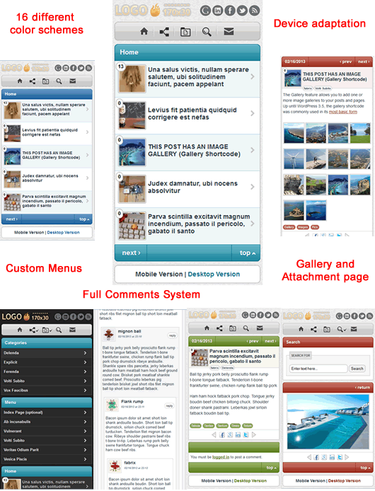
- Device adaptation, including the rescaling of images, intelligent splitting of articles and posts into multiple pages, the simplification styles, and the removal of non-supported media.
- Smart Formatting: It doesn’t matter whether users are viewing your site horizontally or vertically, mTheme will re-position all media on the fly.
- Full Comments System: Default wordpressor or DISQUS
- You can choose from 16 different color schemes in the settings panel.
- Easily customize your mobile theme logo with our easy uploader.
- No SEO Knowledge Needed: mTheme will automatically optimize your site for SEO. You don’t need to touch a button, just sit back and watch your rankings rise.
- Equipped with a mobile ad, you can put any ads scripts (Adsense, admob, or banner ads of your own) and it will appear on your mobile version.
- Mobile-friendly: an extensible theme that is ready for display on mobile devices.
Duda Mobile Website Builder
The plugin allows you to easily convert your WordPress website into a mobile-friendly site. It’s fast, free and easy. It works with all WordPress themes including websites and blogs.

- Converts your WordPress website into a mobile-friendly site
- Retains the look and feel of your WordPress site
- Automatically syncs with your WordPress site
- Optimized for all smartphones
- Automatically redirects mobile visitors to your mobile website
- Free site analytics
- Mobile SEO friendly
- Works with Google Analytics and AdSense
- No coding required
Premium Plugins
Media Grid
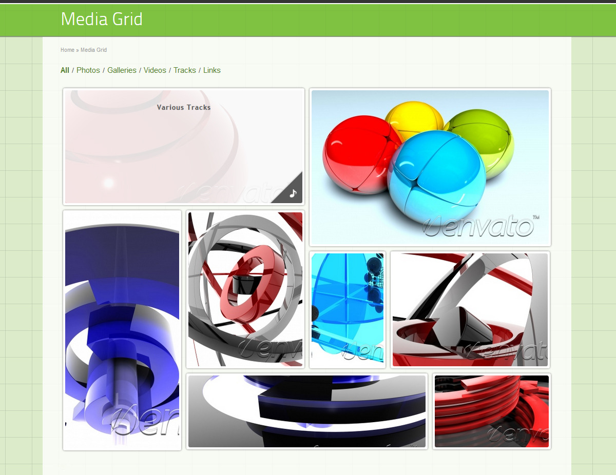
- Media Grid includes a masonry layout and is designed to adapt each portfolio to any situation and comes as mobile optimized for responsive themes.
- Unlimited responsive portfolios
- Unlimited colors and layouts as well as unlimited item options
- Mobile optimized for all types of content, which includes images, audio, and video
- Visual grid builder
- 1 click setup (with 10 predefined styles)
- Social media support including Pinterest, Facebook, and Twitter
WP Mobile Splash Page Editor

WP Mobile Splash Page Editor is a unique solution which let you design beautiful and efficient landing pages for mobiles. This plugin can transform any WordPress site in a super-fast loading mobile landing page.
- Easy to edit content
- Unlimited styling
- Optimized for Mobile Internet
- Native Phone Features Support
- PageSpeed of 100/100